SHOPLINE X AI

UX Designer
PM, developers, senior UX designer and Myself
2 mons
600K
Users (Merchants)
2000
Colleagues
10+
Years
Project Goal
When the product team approached to explore the potential of an AI function for automating generation, I saw both an opportunity and a challenge. Integrating AI into the existing workflow could disrupt user experience if not executed thoughtfully.
To ensure clarity and alignment on the goals, I met with the product team, including PMs, developers, and senior designers. Together, we discussed the project's objectives and emphasized the importance of maintaining a seamless user experience while introducing the new AI capability.
User journey map
Through collaboration with the researchers and marketing teams, I gained a better understanding of their pain points during content creation and research processes.
The manual process consumed hours daily.
The quality of descriptions varied, impacting overall sales.
Not all merchants had strong writing skills, leading to underperforming product listings.

Solutions


The process
Best-Selling Product Descriptions
High
Sale Promotions
High
New Product Announcements
High
Email Subscriptions Campaigns
Medium
About Us/Branding Content
Medium
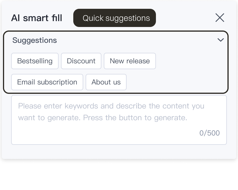
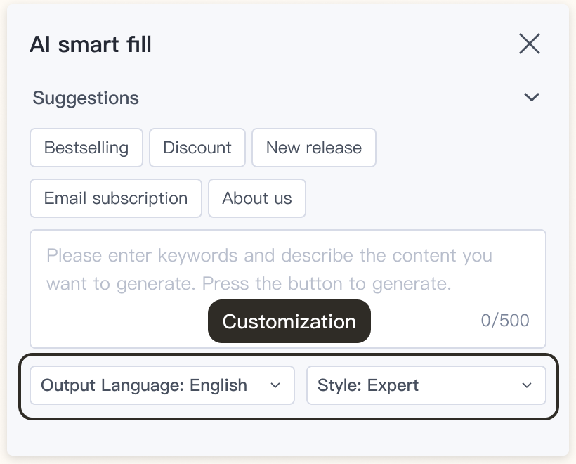
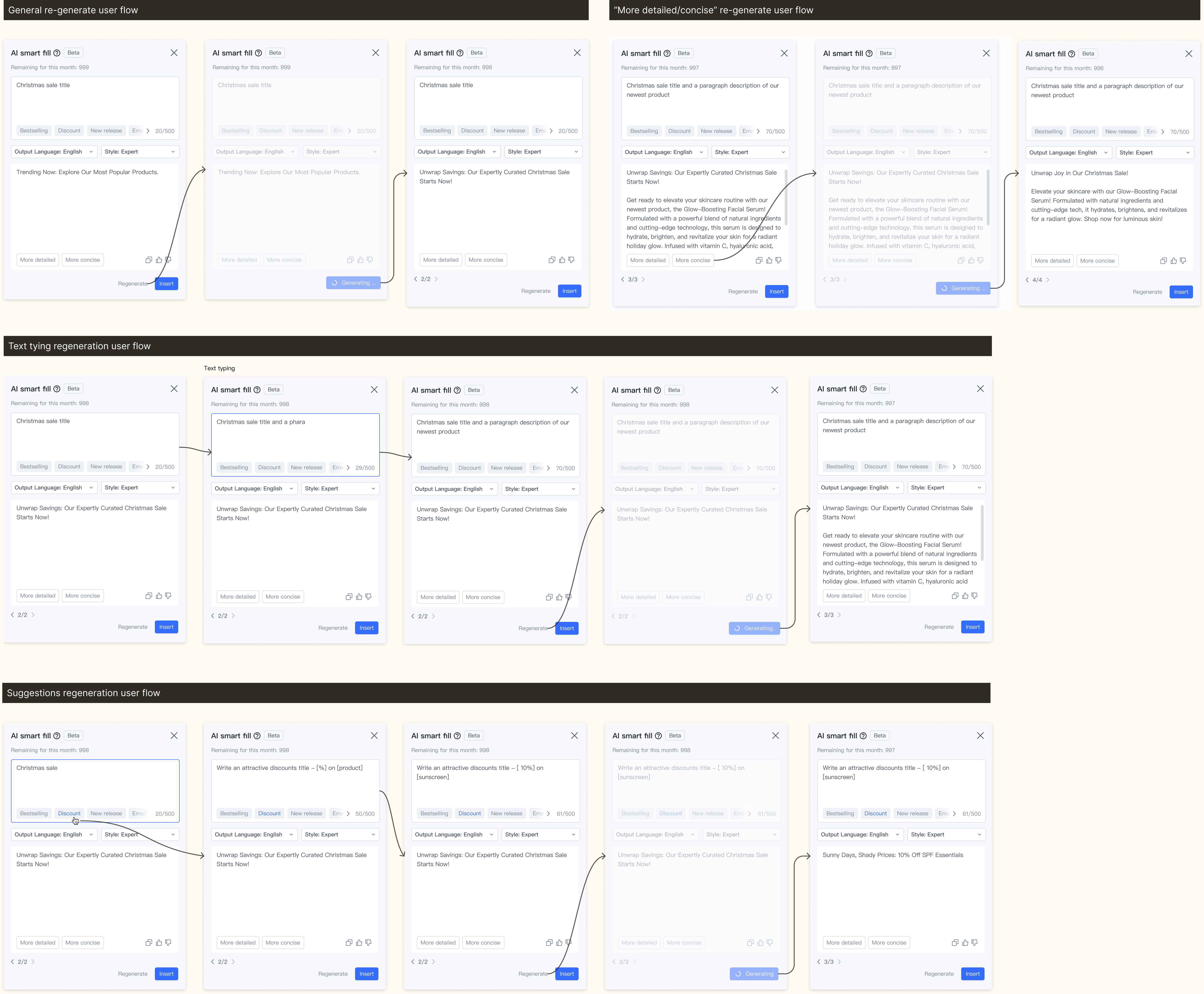
I explored different ways to display text boxes and suggestions, carefully noting the pros, cons, and important factors for each approach.


I explored different ways to display text boxes and suggestions, carefully noting the pros, cons, and important factors for each approach.


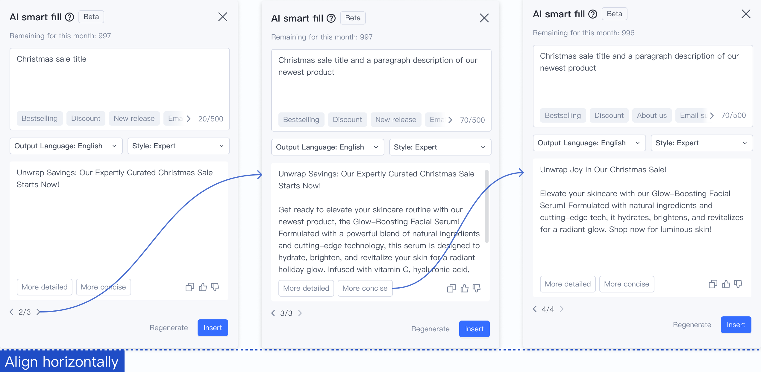
I explored different ways to display text boxes and suggestions, carefully noting the pros, cons, and important factors for each approach.
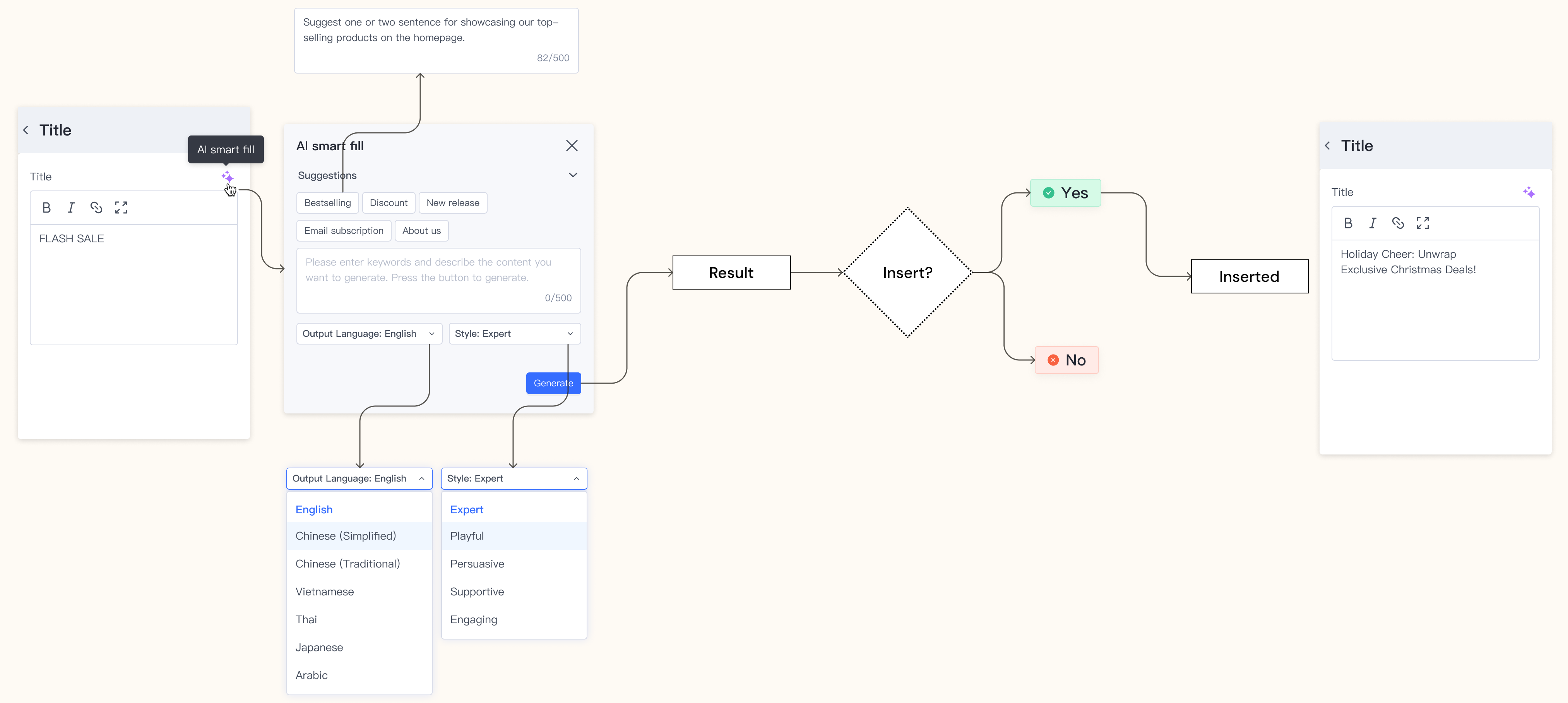
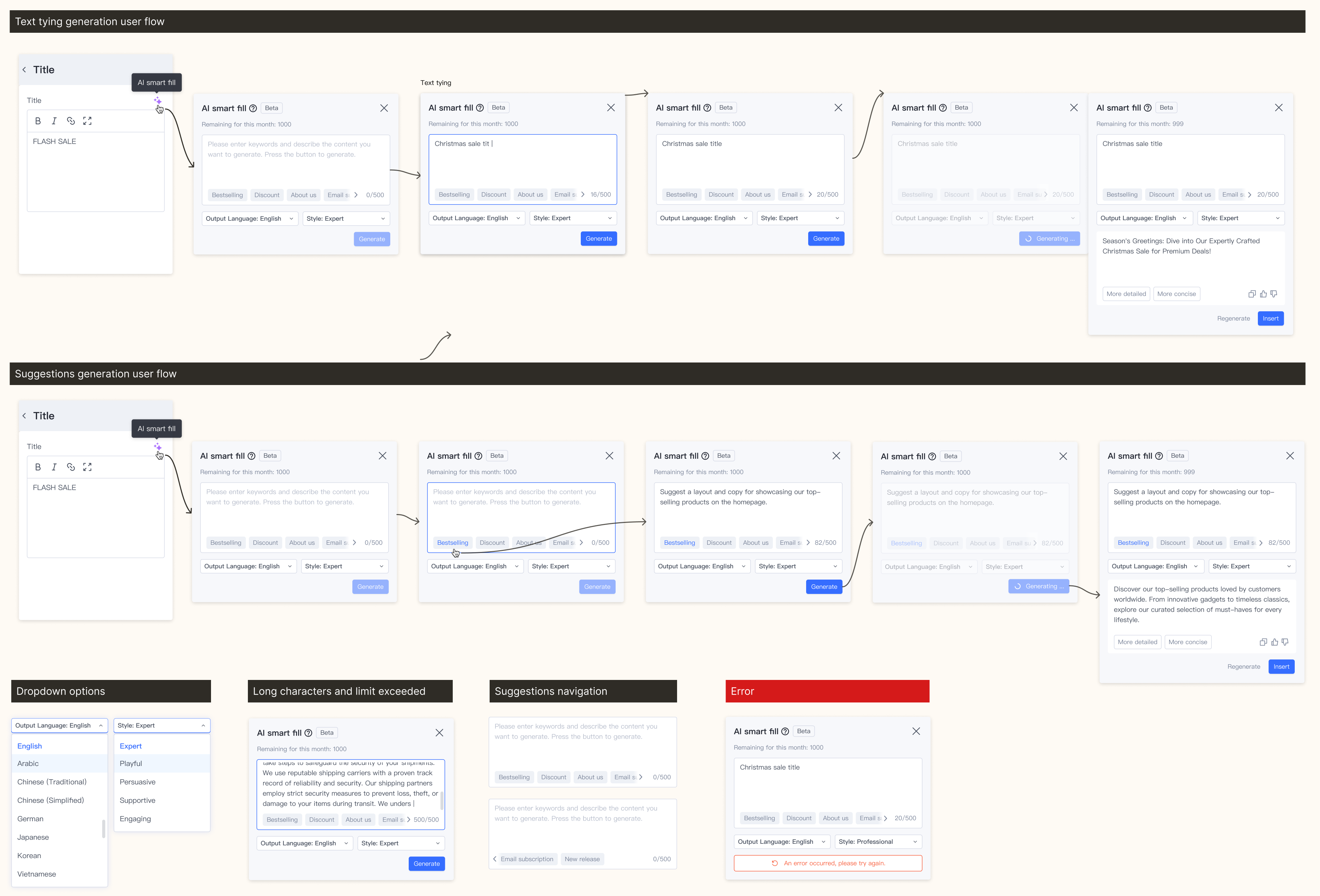
✅ Final design decision - c.
After discussing with the PM, we have a clearer understanding of the tool’s effectiveness. Besides helping users generate relevant content more quickly, it also needs to be effective. Since this tool is primarily used in store design, rather than for product descriptions or blogs, we prioritize concise and impactful wording to attract customers in an e-commerce store. Additionally, for this text tool, unless specific instructions dictate otherwise, it generally produces shorter content to align with user scenarios.

What I learned
1. Learned effective cross-functional team communication.
2. Mastered balancing user needs with technical constraints.
3. Developed attention to edge cases and interface details.
1. Improving design decisions and presentation skills.
2. Cultivating a more detail-oriented design mindset.
3. Finding design solutions that accommodate multiple stakeholder needs.


