Pop-Up Upgrade

Improve pop-up widget customization capabilities.

Role

UX Designer

Team

PMs, developers, Myself

Duration

2 - 3 mons

Design goal

Avoid widget overlap and excessive pop-ups that disrupt the user experience.

The widgets overlapping here are Membership, Chatbox, and Back to Top.

Source: Maxine

Final design

Smarter Position Controls

Improved position controls for better clarity and precision

Separate Settings for Mobile & PC

The widget settings can be customized separately for mobile and desktop platforms.

The process

Initial design

Based on the design requirements, the key feature is the display settings. I created a simple radio button for users to select the initial position direction and incorporated a progress bar to adjust the bottom space, allowing them to prevent overlap with other widgets.

A

Accessibility issue found
- System Consistency

Upon reviewing the initial design, my team discovered that its built-in widget already has its own position direction settings system, which differs from the initial design proposal.

De

Design iteration

My design decision is to extend the use of current visual blocks for position direction settings due to the following reasons:

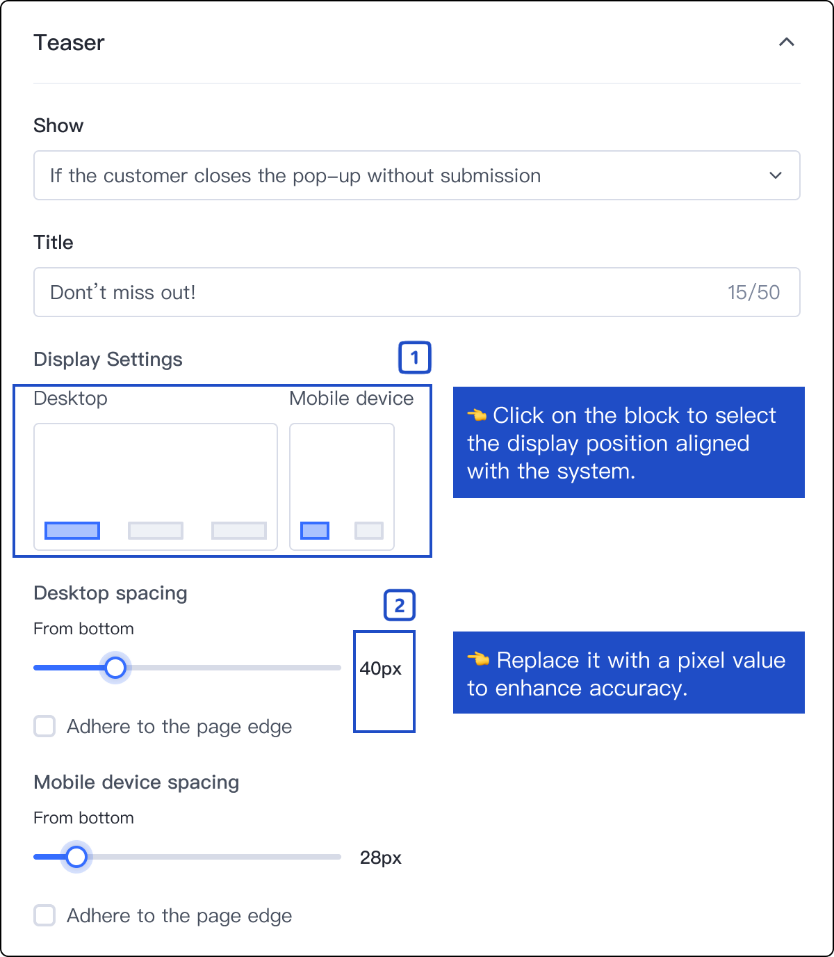
1. Existing users are more familiar with the current display settings.

2. Visual blocks are more intuitive than textual expressions.

3. Edge Cases: Long text in different languages may break position alignment (left/center/right).

N

New challenges

After completing my design, I headed to the review meeting with project managers and design managers. However, I encountered some challenges when presenting it to the team.

C

Competitor analysis

For the default position, the competitor defaults to bottom-left, but many e-commerce shops prefer a left-aligned layout. I redesigned the default to left-aligned and removed the less-used middle block on desktops, as pop-ups for promotions are frequently utilized.

Source: Shopify

E-C shops's pop-up positioning: edge-adhered left-middle/right-middle side. Using a promotion pop-up is common for sharing marketing information like promotion codes, and putting it in the middle makes it more noticeable.

D

Design iteration

After analyzing potential solutions, I conducting tests with other designers and researchers and developed a more comprehensive solution. Bases on the result, I created a more comprehensive solution.

C

Usability testing & Final design

After analyzing potential solutions, I conducting tests with other designers and researchers and developed a more comprehensive solution. Bases on the result, I created a more comprehensive solution.

What I learned

Epilogue and reflection

Key learning:

1. Competitor analysis and research play a vital role in the design process.

Project growth:

1. Initially tended to follow PRDs too rigidly without considering broader user needs.
2. Learned to think beyond basic requirements and documented specifications.