
This tool improves product description accuracy and helps not only merchants create content more efficiently, but also boosting SHOPLINE's competitive edge in the SaaS B2B e-commerce market.

🛑 Problem
The Challenge of Compelling Content Creation in E-commerce
In today's competitive e-commerce landscape, creating high-quality product descriptions is essential for attracting and converting customers. However, merchants often struggle with this task due to:

Busy merchants may not have the time to craft detailed and engaging product descriptions for their entire inventory.
References:
Description writing: 100 words in 10 - 15 mins
General word typing: 100 words in 2 - 5 mins

Not all merchants are skilled writers or have the resources to hire professional copywriters.

Maintaining a consistent brand voice across numerous product descriptions can be challenging.
🔥 Opportunity
The Rise of AI and a Data-Driven
AI in retail market, valued at $5.79B in 2021, will grow over 23.9% annually until 2030. AI offer a promising solution to these challenges. Here's why AI text generation presents a significant opportunity for SHOPLINE and our clients:

Save time and effort compared to manual content creation.

AI can analyze amounts of data to generate customer-centric descriptions.

Explore different writing styles to suit their brand voice.
1. Ensure the tool meets personalized content needs and is easy to navigate.
Further Exploration
The initial phase of the project involved gathering user data to define the functionalities of the AI tool. This included collecting:
• Diverse Use Cases
I identified various scenarios where merchants would utilize the tool, such as creating product descriptions and crafting marketing materials (e.g. Email subscription, discount promotion. etc.)
• User Requirements
Through data insights, we identified the specific features merchants desired in the tool and arranged them by priority.
• Launch Schedule
Considering development constraints and budget, we prioritized essential functionalities for the initial beta release to gather data for future enhancements.
Key Features
5 core features to address merchant needs and ensure a smooth user experience:
• Usage Management
To gather data at Beta verison, we implemented a monthly limit on AI text generation during the beta phase.
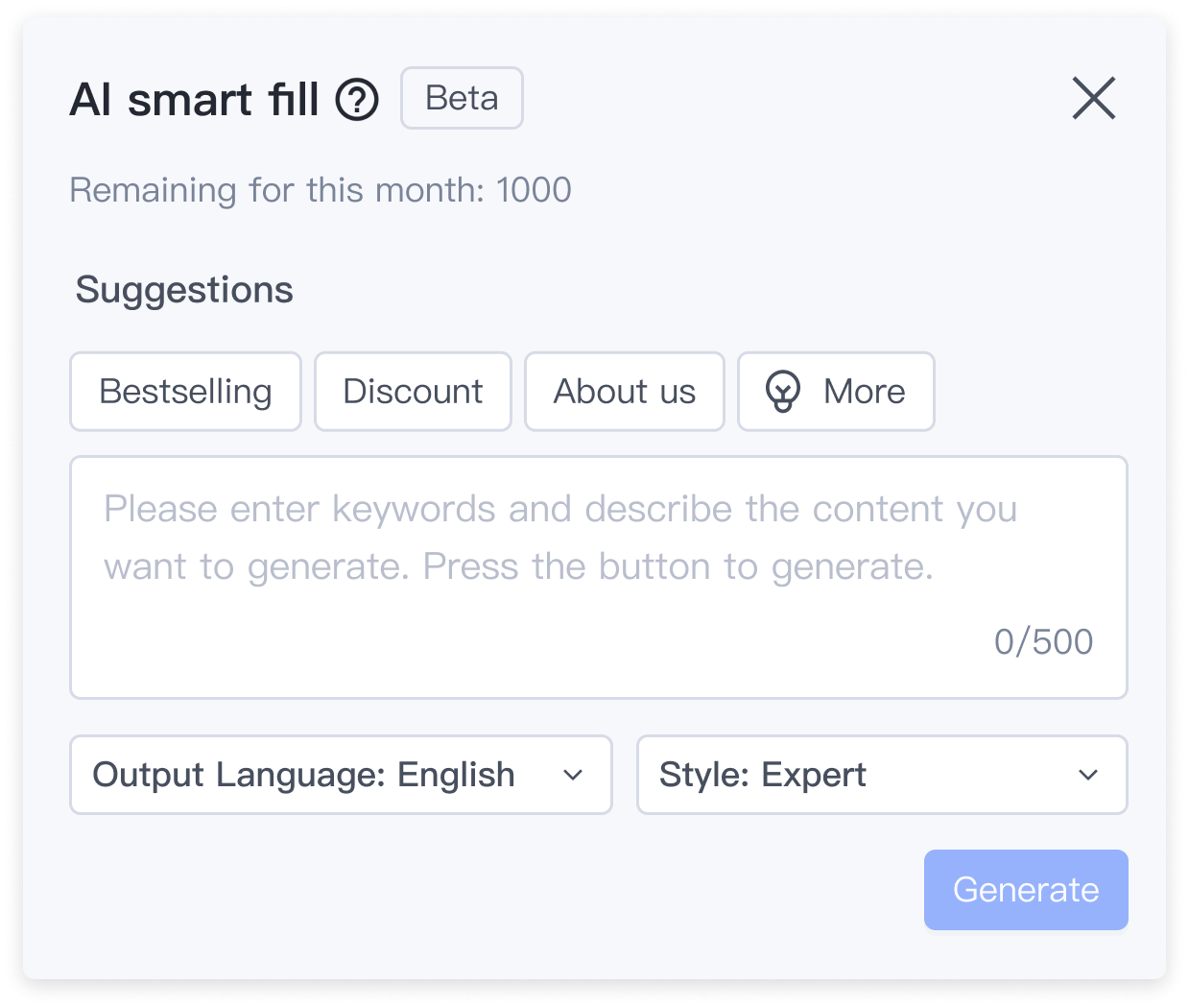
• Content Customization
Smart Suggestions & Tailored Styles: The tool automatically generated 5 relevant content suggestions based on most used and trending. Users could customize output language and content tone to match their brand voice.
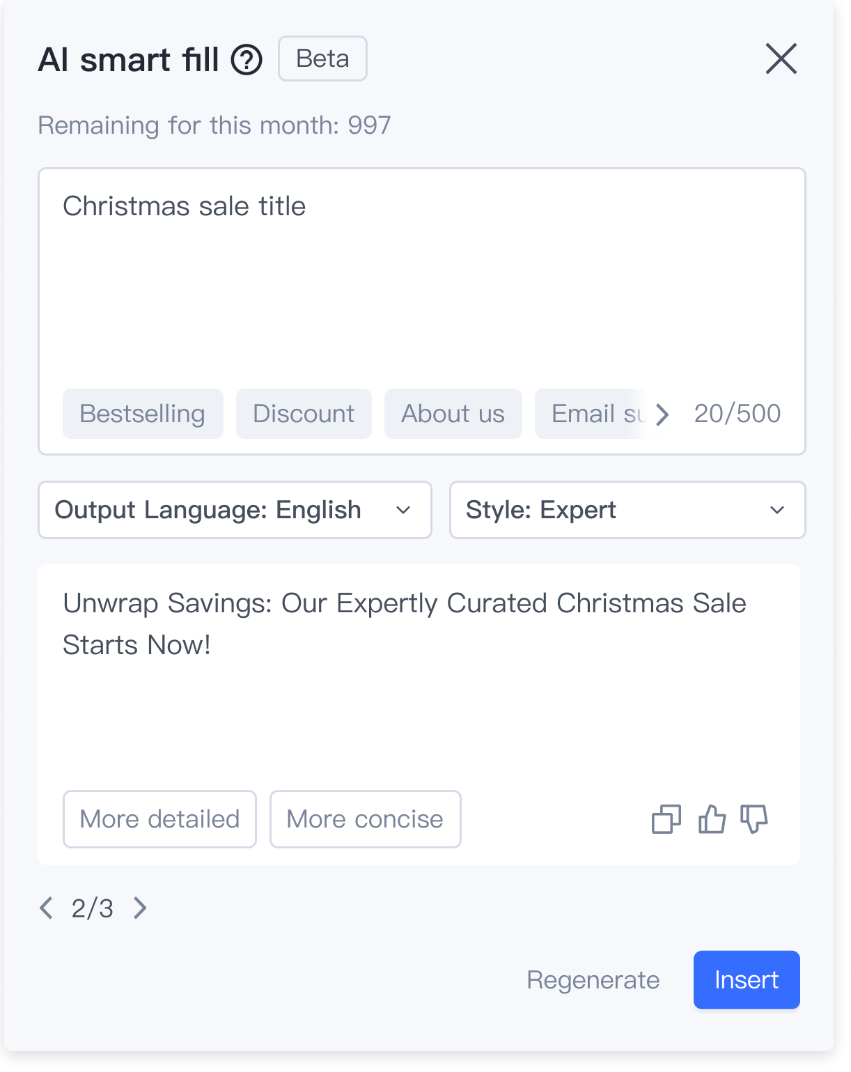
• Content Regeneration and Management
Track & Compare: Users could access a revision history and compare different content variations to easily choose the best option..
• Feedback Integration
Integrated a user-friendly feedback mechanism (e.g., thumbs up/down) to collect user input and continuously improve the tool.
I started conducted a competitive analysis to understand feature prioritization. Specifically, I analyzed competitors' AI content generation tools, focusing on feature prioritization and interface design.

Competitive analysis of AI content generation tool from (left to right): Grammarly, Shopify and Smart landing page-SL.
1. Common Interface Elements:
2. Default State:
3. Customization Option:
Based on my previous research, my initial explorations centered around various approaches for displaying text box and suggestions. For each exploration, I meticulously documented the pros, cons, and relevant considerations.


✅ Final design decision
Design 4: Integrated 2.0
After comparing and iterating, we hosted a small design review section with PM and senior UX designer, and we all agreed with that integrating suggestion buttons 2.0 inside the text box enhances the user experience by providing efficiency, clarity, and context which align with the project goals. And to address the concern, I designed when users click the suggestion navigation, it reveals the previously hidden buttons in full view.
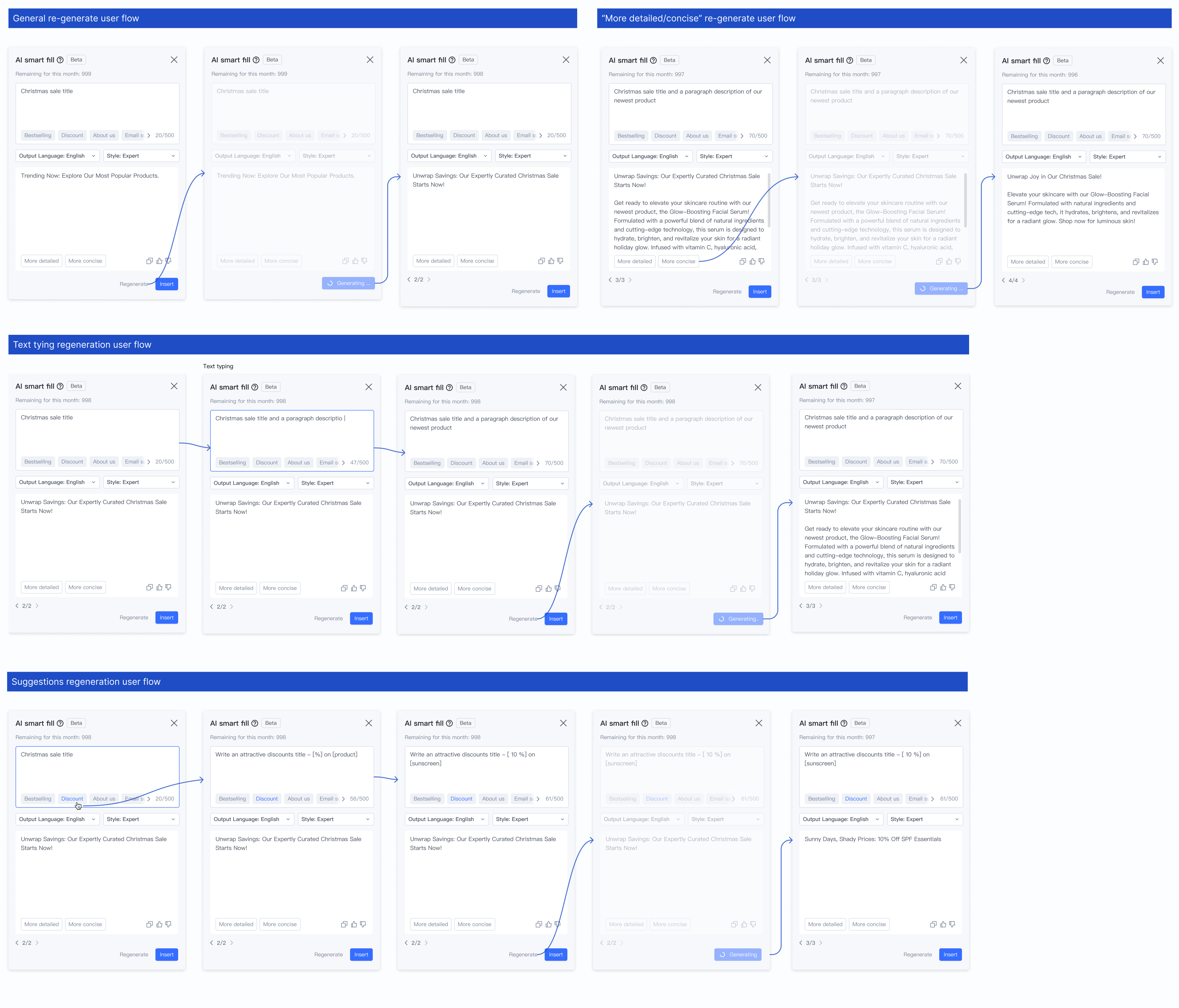
After exploring the default state wireframes, I began drafting the user flow and interactions for text generation. This included designing flows for text typing generation, suggestions generation, as well as handling errors and dropdown options.


We aim to design a feature allowing users to review and compare previous generation results. Following a thorough analysis, two common user flows have been identified:

Competitive analysis of AI content generation tool from (left to right): Shopify, ChatGPT.
I then brainstormed potential solutions based on the competitive analysis.


✅ Final design decision
Design 3: List + Navigation Arrow + longer fixed result area
After discussing with the PM, we have a clearer understanding of the tool’s effectiveness. Besides helping users generate relevant content more quickly, it also needs to be effective. Since this tool is primarily used in store design, rather than for product descriptions or blogs, we prioritize concise and impactful wording to attract customers in an e-commerce store .Additionally, for this text tool, unless specific instructions dictate otherwise, it generally produces shorter content to align with user scenarios. Based on this, we find “Design 3” is works even with some cons.
After exploring the popover, I began drafting the user flow and interactions for text generation. This included designing flows for text typing generation, suggestions generation, as well as handling errors and dropdown options.

After completing the interface and interaction design, during the final design review with project PMs, design managers, and developers. All 10 of them were able to successfully use the tool, and then the design was passed to the developers' team for implementation.
Here's a video showcasing the prototype I used during usability testing.
1. User engagement:
2. Quality:
3. Efficiency & user satisfaction:
This project taught me valuable lessons about cross-functional collaboration and making design decisions that balance various stakeholder needs. Key learnings include:
1. The importance of clear communication with non-design team members
2. How to make design trade-offs that satisfy both user needs and technical constraints
3. The value of focusing on edge cases and details in complex interfaces
Unlike before, where I might have chosen the most suitable option despite its limitations, this time I needed to find the most convenient solution that aligned with all the design requirements, UX, and interaction design. This process took me a while before moving on to the next step.
Fortunately, my mentor and design manager provided useful assistance, offering advice when I encountered obstacles in explaining and developing a better design, as well as presenting design decisions. Through this experience, I also learned to focus more on the details and edge cases that I might not have noticed before.
This was my first project as a lead designer during my internship. One of the most valuable lessons I learned from this project was how to communicate and collaborate not only with designers but also how to make design decisions that are convenient for other stakeholders. For instance, when I generated multiple potential solutions, none of them might be the "perfect" one, as each had its limitations.
Unlike before, where I might have chosen the most suitable option despite its limitations, this time I needed to find the most convenient solution that aligned with all the design requirements, UX, and interaction design. This process took me a while before moving on to the next step.
Fortunately, my mentor and design manager provided useful assistance, offering advice when I encountered obstacles in explaining and developing a better design, as well as presenting design decisions. Through this experience, I also learned to focus more on the details and edge cases that I might not have noticed before.
Lorem ipsum dolor sit amet, consectetur adipiscing elit. Suspendisse varius enim in eros elementum tristique. Duis cursus, mi quis viverra ornare, eros dolor interdum nulla, ut commodo diam libero vitae erat. Aenean faucibus nibh et justo cursus id rutrum lorem imperdiet. Nunc ut sem vitae risus tristique posuere.


