Design problems
1. Other app's widgets overlap and obstruct each other.
2. Avoid pop-up window excessively disturbing customers.

The widgets overlapping here are Membership, Chatbox, and Back to Top.
I collaborated with PMs and engineers on the development of the pop-up widget’s settings and preview. This new feature for the pop-up window supports merchants in customizing smaller subscription pop-ups and offers broader customization capabilities to enhance the overall user experience.
1. Other app's widgets overlap and obstruct each other.
2. Avoid pop-up window excessively disturbing customers.
The widgets overlapping here are Membership, Chatbox, and Back to Top.
1. Enhances customer experience with subtle reminders and pop-up reopens, aiding merchants in successful data collection (e.g. sign up form).
2. Improve pop-up window capabilities to avoid multiples widgets overlapping.
4. Collaborated with PMs and developers throughout the entire design and implementation process.
Based on the design requirements, the most important part is display settings. I designed the initial position direction setting using a straightforward and visible radio select. Users had the option to adjust the bottom space through a progress bar from bottom to top to prevent any overlap with other widgets in the app based on their need.

After the initial design, I spotted the widget had two separate position direction display settings, which could impact user experience. Since the widget is an additional feature, its settings should be consistent with the window. Therefore, I need to decide whether to retain the current position direction or modify the window setting to match my initial widget display settings design.


1. Existing users are more familiar with the current display settings.
2. Visual blocks are more intuitive than textual expressions.
3. Edge Cases: In different languages, textual expressions with long characteristics are no longer consistent in terms of their position on the left, middle, or right.

Following team discussions and agreement, I initiated an iterative design. The design, shown below:

After completing my design, I headed to the review meeting with project managers and design managers. However, I encountered some challenges when presenting it to the team.
Challenge 1:
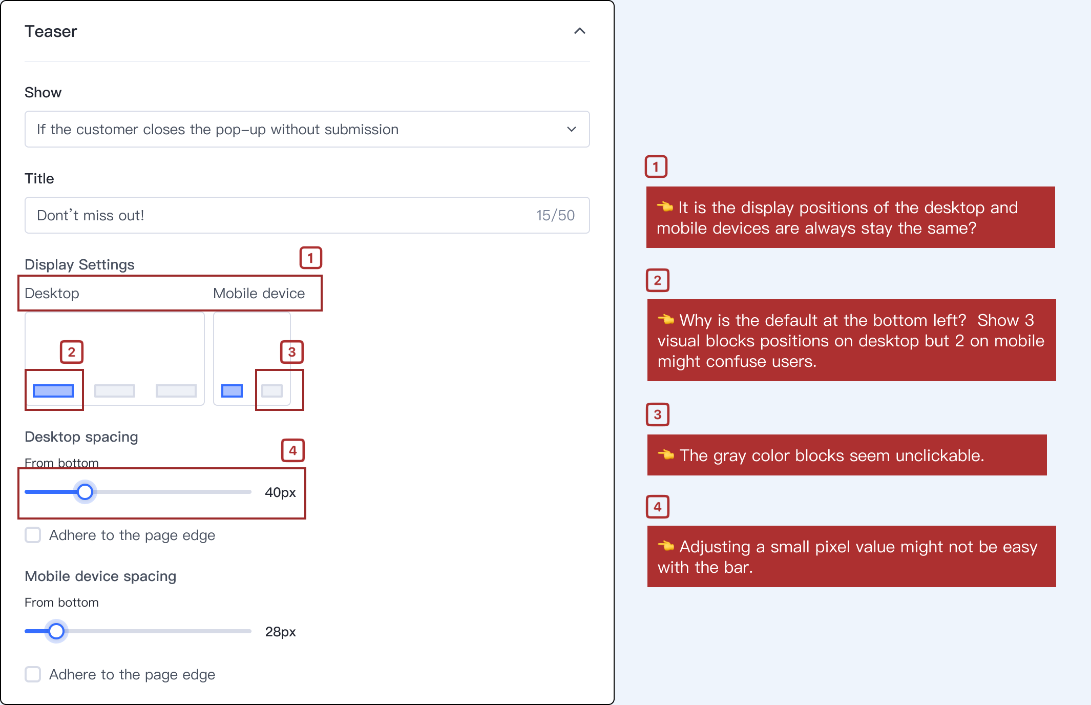
Is it the display positions of the desktop and mobile devices are have to show at the same time?

Design decision :
No, they do not have to synchronous.

Considerations:
For users:
1. To provide users with greater flexibility.
2. Research indicates that many pop-up windows differ between desktop and mobile devices.
For SHOPLNE,
1. SL technology can support the pop-up widget separately appearing on one device.
Challenge 2:
Why is the default at the bottom left? Show 3 visual blocks positions on desktop but 2 on mobile might confuse users.
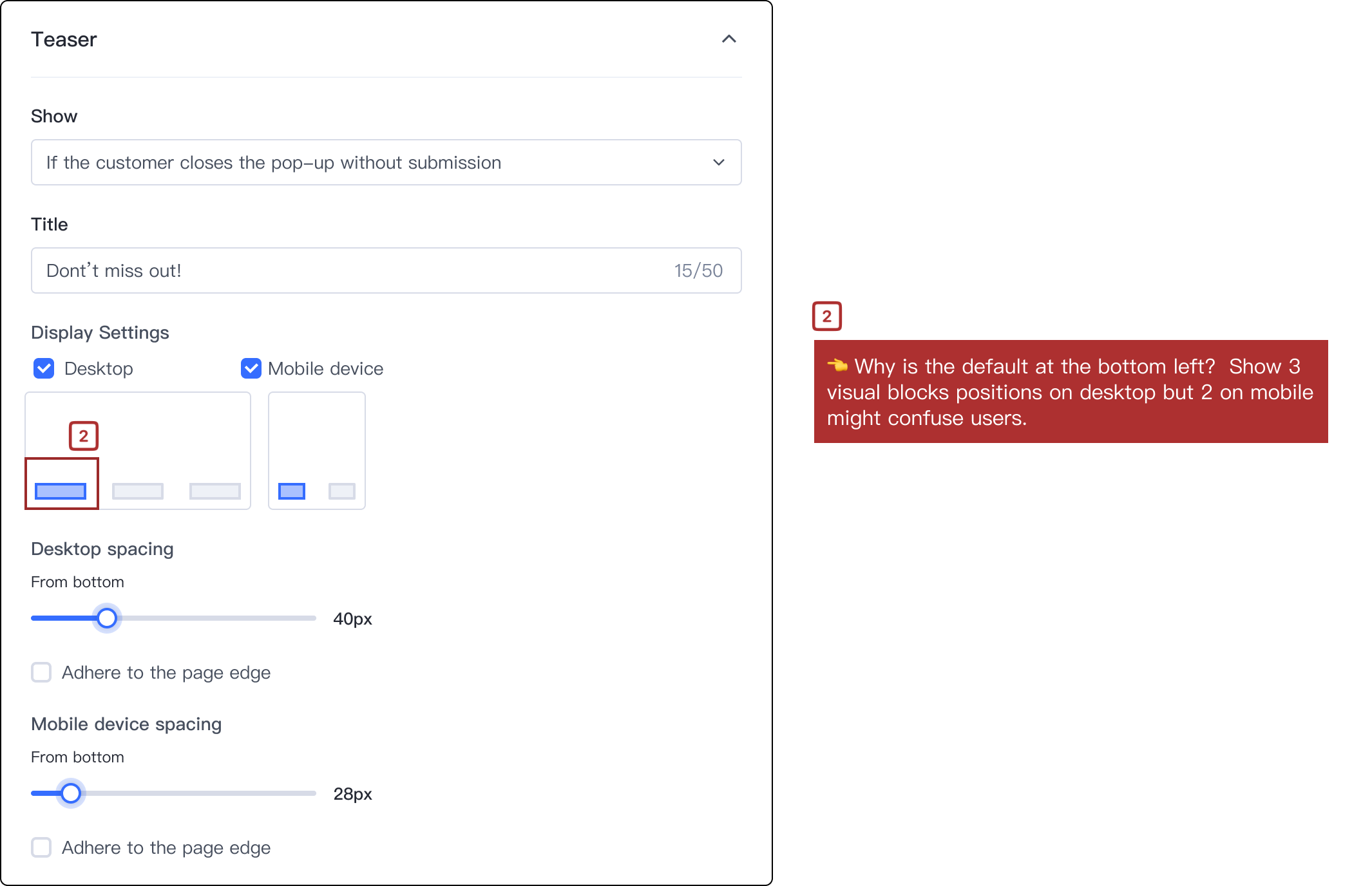
Design decision:
Chang the default settings to middle - left edge adhere and consistency the visual blocks, the mobile device display setting change to left to match the preview feature.

Considerations:
Competitor defaults to bottom-left, but many e-commerce shops prefer left-adhered. I've redesigned the default to left-adhered and removed the less-used middle block on desktops due to frequent use of pop-ups for promotions.
• Competitor's default positioning: Bottom-left. The system defaults to a standard sign-up popup for the small card, which, in terms of priority, may be considered relatively lower compared to other information (such as promotion pop-ups).

• E-C shops's pop-up positioning: edge-adhered left-middle/right-middle side. Using a promotion pop-up is common for sharing marketing information like promotion codes, and putting it in the middle makes it more noticeable.

Challenge 3 & 4:
The gray color blocks seem unclickable, and adjusting a small pixel value might not be easy with the bar.

Design decision:
Darken the block border. Users are allowed to specify the pixel in the text box.

After analyzing potential solutions, I conducting tests with other designers and researchers and developed a more comprehensive solution. Bases on the result, I created a more comprehensive solution.

Following a new round of design review with PMs and developers, this design solution was ready to progress into the implementation phase. I also identified some points that could be improved and wanted to ensure bringing it closer to the "best" solution before heading to the developers.

Throughout this experience, I realized the significance of competitor analysis and research, as well as the importance of being mindful of the budget. I also learned that during the design process, the PRD can undergo changes at any time. In such situations, it's crucial for designers to prioritize user needs and advocate for them.
As a junior designer, I've noticed it's easy to only stick strictly to the PRD, but less think more about real-user cases. But I've learned the value of going beyond that. Mapping out complete user flows has been a game-changer. It's helped me uncover unexpected scenarios and make the user experience even better.


