
In a world where travelers often encounter the complexities and stress of trip planning. As a UX designer, I collaborated with other product designers, graphic designer and researchers in 4 months to transform it into a seamless and enjoyable process. Auto-generate personalized trip plans in 0 effort and help travlers enhance their budget and transportation management.

100%
were able to complete the core task of creating a customized trip plan successfully.
90%
thought Travel BlindBox has successfully achieved the goal of helping the travelers plan their trips in an effective, joyful and easy way.

Travelers aged 18 ~ 35 are the target audience.

90% of travelers use phones during trip planning.
.png)
Budget considerations are a top priority.

Challenging to estimate transportation times & costs.
.png)


.png)


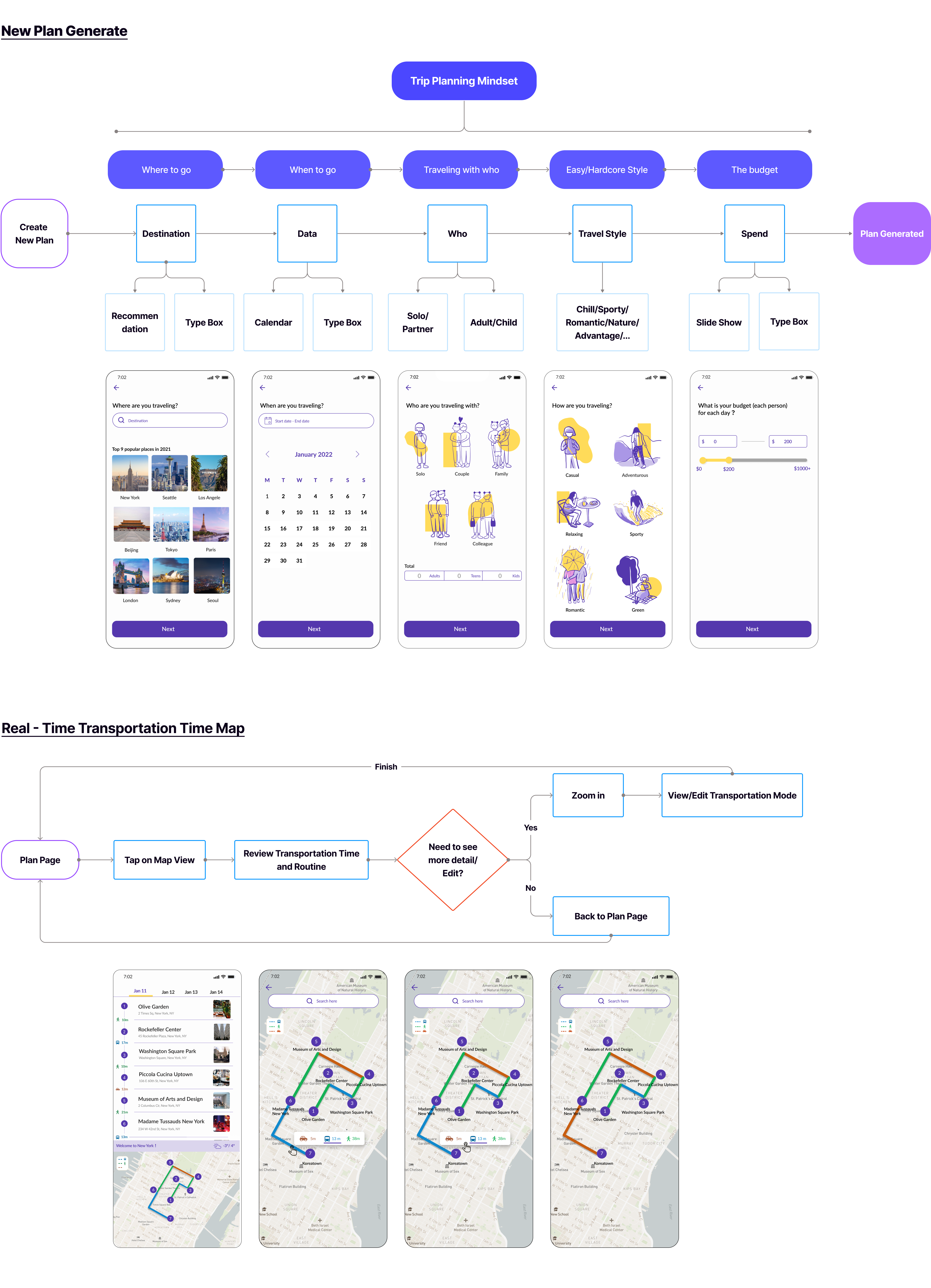
With all the research insights as foundation, I began building the user flow to test the product's workflow.The user flow starts with five questions (where, when, who, how, and budget) for a personalized trip plan. Inspired by the initial sketch, the product includes a map feature for real-time timing estimates and route information.
After sketching the user flow, I identified numerous opportunities and edges cases for further exploration and improvement.We encountered several critical design considerations that shaped our approach. I decided to delve into these considerations and the questions we explored to guide our design process.


To address the above concerns, we conducted additional research and brainstorming sessions, initiating the 1st round of design iterations. By using servals research methods and UX psychology, the solutions are:

Most AI competitors offer a saved list feature for each generated plan, which we found to be a necessary function for helping users better manage their plans. Based on user-friendliness, generated plan list display up to five plans, staying within the 'magic 7' range for improved user management.


I designed show costing for each activity, particularly for restaurants where cost estimation might be required. Additionally, a budget bar slider has been added to reflect the cost.

Our strategy is to differentiate the product from the competition by providing users with more personalized experience. We believe in allowing users to make basic adjustments within the product budget constraints, which we find acceptable.
We designed one approach for changing transportation methods. Since estimating transportation time is also a concern, it's a priority to allow users more options to help them edit.


We believed we were making good progress, but we also highly valued what potential users had to say. During the usability test, we asked potential users to go through the entire plan generation process and identify any confusing or unclear points. Based on the user feedback, we prioritized to edit the necessary tasks which align with our mission.


I cooperated with three teammates who were from different academic backgrounds (psychology, business, architecture, and graphic design) and wanted to change their future career path to UX/UI design. Since we have different backgrounds, so we saw problems from various perspectives to find the user's problems. And I have learned a lot from them.
I would conduct more round accessibility interviews better to understand our users' experience in the future. Overall, I learned a lot through this design process and really enjoyed the design journey this time.


